 Nam
Nam
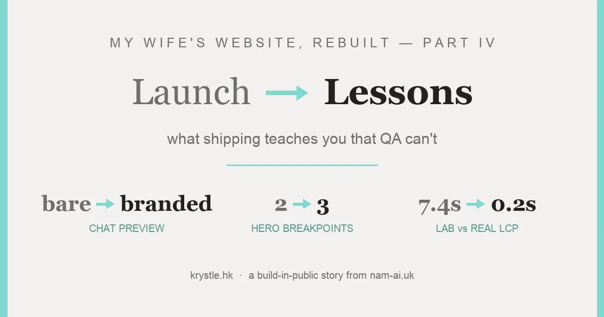
Parts I–III ended on a high: krystle.hk rebuilt, live on Cloudflare, straight 100s on the scoreboards. QA had checked 815 links, exercised every button, diffed every page against the original.
Then my wife shared her own site in a WhatsApp chat, and sent me a screenshot: the preview card was bare. A bold URL as the “title”. No image. No description. For an MC whose bookings spread through referral group chats, that preview is the business card — and it looked like a suspicious link.
This part is the reality-check chapter: three things that only showed up after launch, and what each one teaches. (Part III teased a 「張可澄 司儀」 ranking follow-up — that needs weeks of Search Console data to be worth writing, so it’s still coming. This is what the first day taught instead.)
Table of contents
Open Table of contents
Story 1 — The WhatsApp preview: Part II fixed what visitors see, Part III fixed what Google sees. Friends in a group chat? That’s Part IV.
First instinct: the rebuild shipped full Open Graph tags in Part III — did something break? Check like the crawlers check, with their actual user-agents:
curl -s -o /dev/null -w "%{http_code}" -A "facebookexternalhit/1.1" https://krystle.hk/
# 200 — and the response body carries the full OG tags. Not blocked, not missing.
Both facebookexternalhit and WhatsApp’s agent got 200s with complete tags, from the apex and www. The og:image existed (200, 25 KB). Nothing was broken now. Two real causes:
- WhatsApp’s preview cache is a fossil record. The link had been shared before the DNS cutover — when the old WordPress site, with zero OG tags, was still answering. WhatsApp and Facebook cache previews per-URL, aggressively. The bare card wasn’t the new site failing; it was the old site’s ghost.
- The og:image was weak anyway — a hero crop that was ~60% empty watercolor wash. Centre-cropped into a chat thumbnail, it showed… nothing.
The screenshot said www.krystle.hk, so I burned twenty minutes suspecting the subdomain. Both hosts serve the site fine; canonical and og:url point at the apex. When a preview looks wrong, suspect the cache before the URL.
The fix: a banner rendered by the site itself
Instead of composing a promo card in an image editor (and hunting for font files), we pointed a headless browser at the live homepage at exactly 1200×630, hid the nav, injected one extra line — 張可澄 · 香港專業雙語司儀 — and took a screenshot. The brand fonts are pixel-identical because they are the site’s fonts — including Part II’s kerning fix. 49 KB, comfortably inside WhatsApp’s large-preview limit.
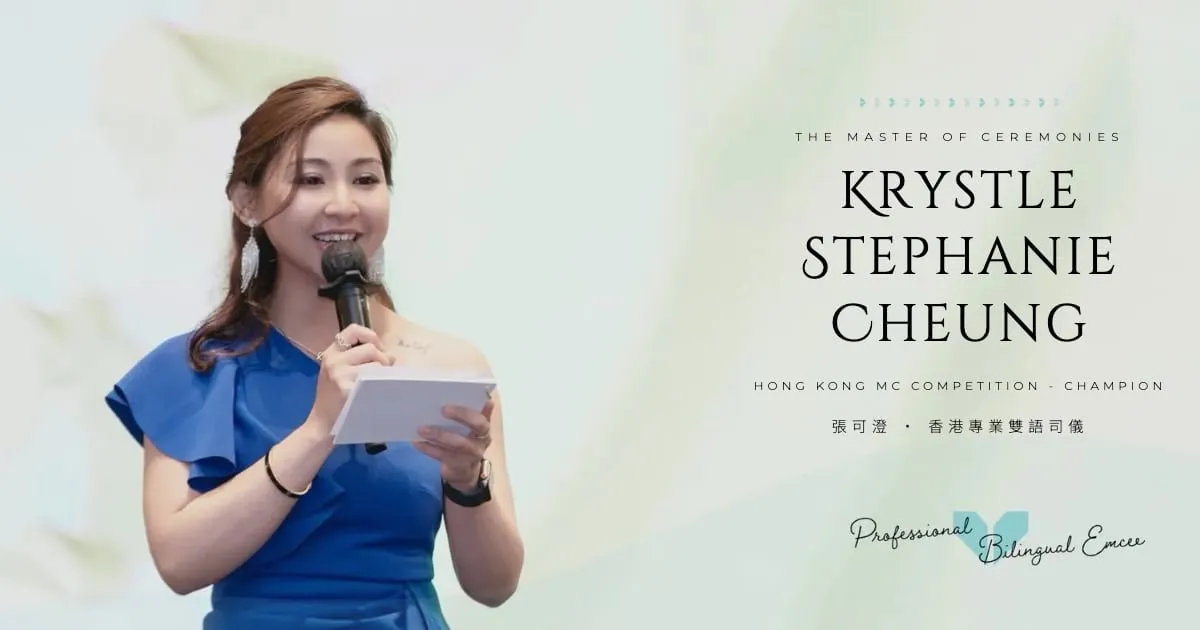
The banner: rendered from the live hero, not recreated in an editor.
Then the metadata, verbatim from the live page — note the new filename, which busts the per-URL cache:
<meta property="og:image" content="https://krystle.hk/img/og/banner-krystle.jpg">
<meta property="og:image:secure_url" content="https://krystle.hk/img/og/banner-krystle.jpg">
<meta property="og:image:type" content="image/jpeg">
<meta property="og:image:width" content="1200">
<meta property="og:image:height" content="630">
<meta property="og:image:alt" content="香港雙語司儀 MC Krystle Cheung 張可澄">
The home, about, portfolio and 404 pages use the banner. The 85 event pages keep their own event photo as og:image — share a specific event in a chat and the preview shows that event, which is better promotion than any generic banner.
The last mile is human: WhatsApp still holds old previews per-URL. Sharing into a new chat shows the fresh card immediately; for stubborn caches, Facebook’s Sharing Debugger → “Scrape Again” does it (WhatsApp rides Facebook’s crawler infrastructure).
Story 2 — The 768px bug nobody tested
Next morning, a post-launch audit of the live site on real device sizes. Phones (390px): fine. Desktop (1440px): fine. iPad portrait (768px): the phone hero loaded with her name typeset straight across her face, clipping off-screen.
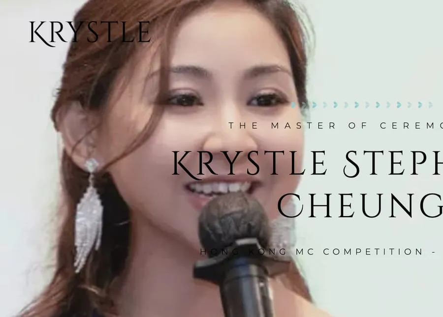
768px, the viewport QA forgot: phone composition, tablet size, name across the face.
QA missed it the classic way: “mobile” meant 390, “desktop” meant 1440, and nothing in between was ever opened. But 601–1024px is a real audience — iPads, landscape phones, small laptops.
The actual lesson: art direction is not responsive resizing. This hero isn’t one image that scales — it’s three different compositions: desktop (her left, text right), tablet (her left, more headroom), phone (portrait crop, text on top). The original designer had made all three. The rebuild’s breakpoints mapped the phone composition to everything ≤900px — so text positioned for the phone crop landed on a tablet-size render of the wrong image.
The fix is proper three-way art direction — this is the live markup:
<source media="(max-width:600px)"  srcset="/img/hero/mobile-828.webp"  width="828"  height="1150">
<source media="(max-width:1024px)" srcset="/img/hero/tablet-1200.webp" width="1200" height="1250">
<!-- desktop <img> above 1024px -->
…plus matching text positions per range, and per-source width/height so there’s zero layout shift. About 15 lines of CSS and two HTML attributes. Finding it just required looking at one viewport nobody looks at.
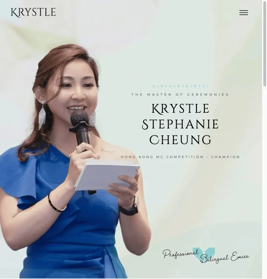
After: tablets get the tablet composition, name in the clear space.
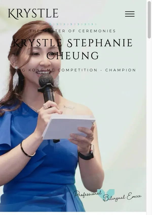
And the phone hero after type tuning — the full composition uncropped, face clear.
Story 3 — Cornering the phantom LCP
Part I left a caveat open: Lighthouse’s simulator claimed a 6.5-second LCP while its own filmstrip showed 1.9s and a real trace showed 0.2s. Post-launch, the plot thickened: Google’s PSI on the live site never showed the phantom (mobile LCP 2.9–3.7s, desktop 0.6s — the screenshots in Parts I and III). But a stock Lighthouse CLI run against the same live URL still modeled 7.4s. Same page, same network — two “lab” numbers four seconds apart.
The report itself carried the smoking gun: observedLoad: 344ms, observedFirstPaint: 1334ms. The page actually painted everything almost instantly — the simulator was multiplying whatever that single paint depended on.
So: bisection. Eleven variants against the live site. Kill the animations — no change. Kill the marquee — no. Inline the CSS — worse. Single hero image instead of <picture> — no. Drop the font preloads — no. font-display: optional — no. Load fonts via JavaScript after window.load — still 6.5s. Remove @font-face entirely — 1.35s.
Lighthouse’s Lantern simulator builds a “pessimistic” dependency graph for LCP that includes every network request in flight before the paint. A 272 KB Chinese font subset (plus four Latin subsets) on simulated Slow-4G ≈ seconds of modeled delay glued onto LCP — regardless of font-display, regardless of the fact that real browsers paint immediately with the fallback and swap invisibly. Every site with CJK fonts hits this tension; if you build for a Hong Kong or Taiwan audience, your lab LCP is probably lying to you the same way.
The kicker that ended the investigation: removing fonts made simulated FCP worse while “fixing” LCP. The model wasn’t even internally coherent. At that point you’re no longer optimizing a website — you’re optimizing a model’s opinion.
Resolution: keep the font strategy that’s optimal for real users (preload + swap, FCP 1.7s), trust the three measurements that agree (filmstrip, DevTools trace, field data), and let CrUX field numbers accumulate — that’s what Google actually ranks on anyway.
The live site briefly scored SEO 92 instead of 100 — Cloudflare’s AI-crawl-control feature edge-injects a Content-Signal: line into robots.txt, and Lighthouse flags the directive it doesn’t recognise. One dashboard toggle restores 100. Worth knowing: what you deploy is no longer exactly what you serve.
What shipping taught us
None of these three would ever appear in a local QA run: a chat app’s cache predates your deploy, a viewport nobody opens, a simulator’s opinion of fonts. They only exist in production, with real users — in this case, the most motivated user there is: the site’s owner, sharing her own site.
The workflow held up in anger, though. Bug report (a WhatsApp screenshot from my wife) → fix → git push → live in about a minute. That loop — not the Lighthouse scores — is the thing worth having.
And the series arc closes where it should: krystle.hk now looks right on every screen including the ones nobody tests, and sharing it in a chat finally looks like what it is — promoting Krystle.
This series: Part I — WordPress → static HTML, and the honest pros and cons · Part II — the UI · Part III — the SEO story · Part IV — you’re here. The 「張可澄 司儀」 ranking check comes when Search Console has something to say.
Shipped something and then learned something? That’s the good kind of bug report — email me.