 Nam
Nam
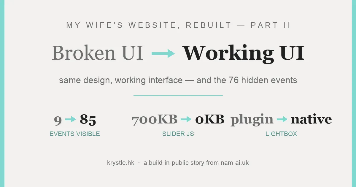
In Part I, we rebuilt my wife Krystle’s WordPress portfolio — krystle.hk — as 102 pages of static HTML: the architecture, the numbers, and the honest pros and cons.
This part is about what you can actually see and touch: the interface. The brief said no redesign — same look, same layout, same feel. So every screenshot here should look boring. The interesting part is that underneath, every interaction changed — including the one that had been silently hiding 76 of her 85 events from every visitor.
Table of contents
Open Table of contents
Same design — that was the point
Before writing a line of the rebuild, the audit extracted the design’s DNA so it could be reproduced faithfully: the Tiffany-teal #81D8D0 accent, the warm off-white #F2F1EF, Cinzel Decorative for the hero, Cormorant Infant for serif accents, Montserrat for headings, Noto Sans TC for body text — thin weights and wide letter-spacing throughout.
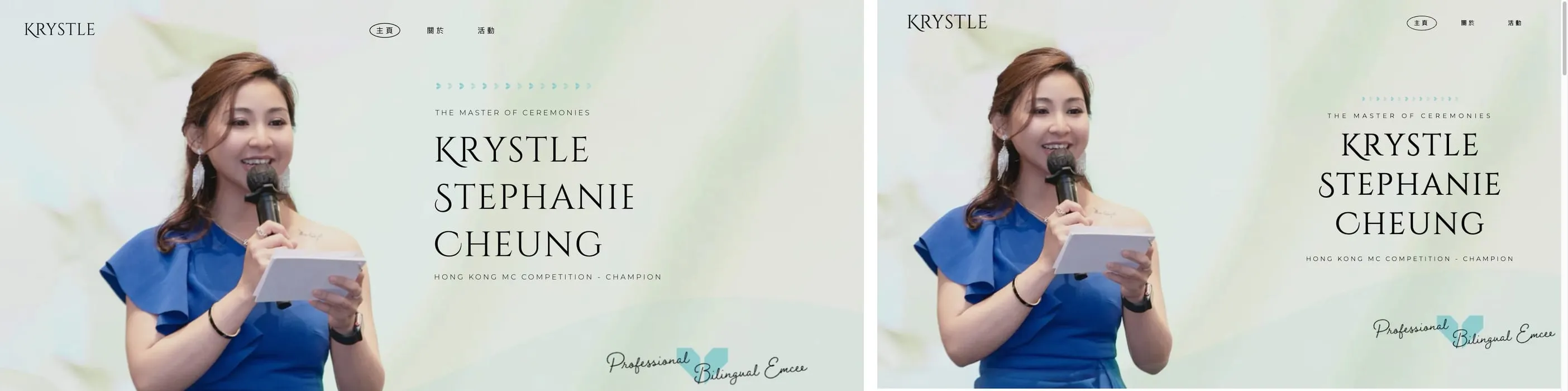
Fidelity check — original left, rebuild right. If you can’t tell them apart, the UI work succeeded.
The hero: 700 KB of slider, replaced by an image
The old hero ran on Slider Revolution — roughly 700 KB of JavaScript to display… one static composition. The rebuild does it with a composed image and CSS-positioned text layers. Zero JavaScript, same visual.
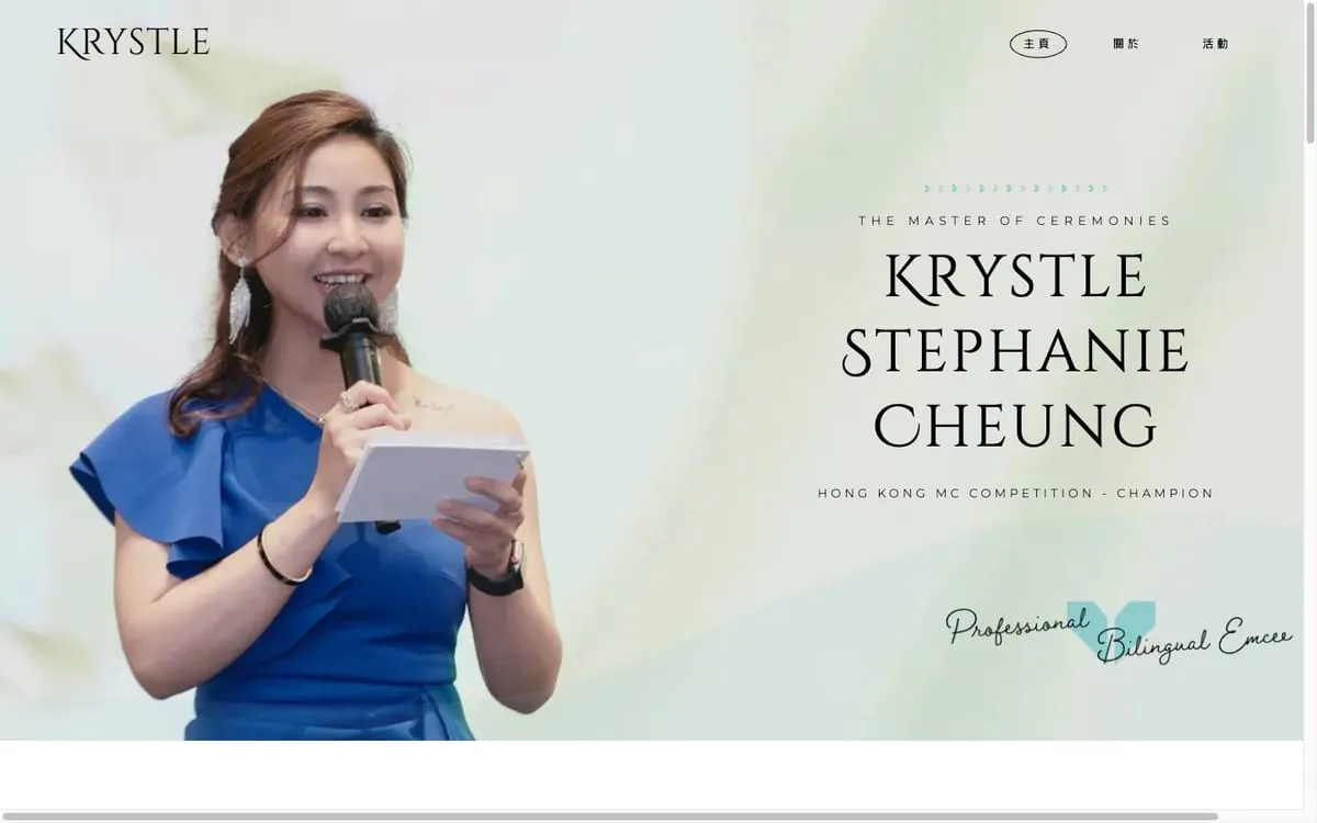
The rebuilt hero. What the slider plugin did with 700 KB, position: absolute does for free.
The scroll-in animations got the same treatment: jQuery + GSAP became ~30 lines of IntersectionObserver and CSS transitions.
The portfolio that hid 76 events
Here’s the bug from Part I’s teaser. Driving a real browser against the old site with the network tab open, one request kept failing:
wp-json/cassia/v1/get-posts → 403
The theme’s “Load More” button fetched events through a REST call protected by a security nonce baked into the cached page. The cache plugin kept pages longer than nonces live. So for real visitors the nonce was always stale, the endpoint always returned 403 — and the portfolio silently stopped at the first 9 of 85 events.
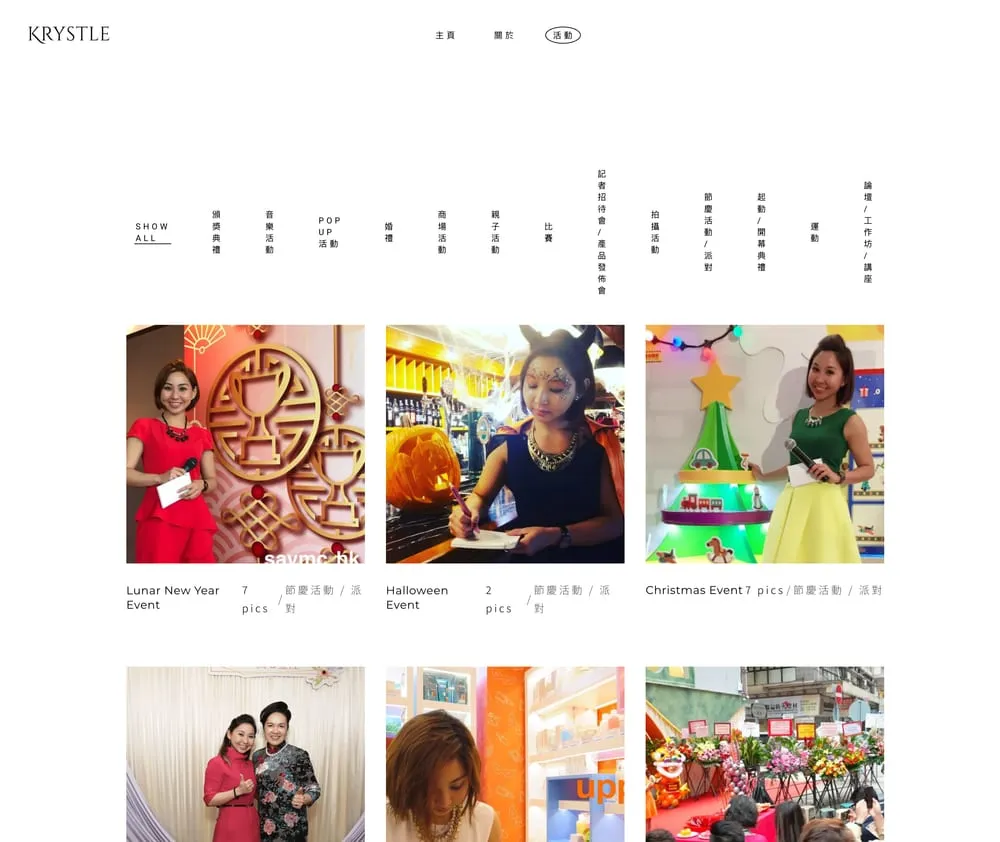
What every visitor saw: nine events, and a Load More button that looked fine and did nothing.
The button rendered. Nothing errored on screen. It had probably been broken for a long time — and for an MC, the portfolio is the sales pitch: clients were seeing a ninth of it. If your site loads content with a button or an infinite scroll, go and click it in a private window today.
The rebuilt portfolio makes this failure structurally impossible: all 85 cards are pre-rendered in the HTML. The filter shows and hides; the button un-hides nine more. This is the actual shipped code, lightly trimmed:
// portfolio filter + load-more (all cards are in the DOM; no network)
var PAGE = 9, shown = PAGE, active = '*';

function apply() {
  var vis = 0;
  cards.forEach(function (c) {
    var match = active === '*' ||
      (' ' + c.getAttribute('data-cats') + ' ').indexOf(' ' + active + ' ') > -1;
    c.classList.toggle('hide', !(match && vis < shown));
    if (match) vis++;
  });
}

more.addEventListener('click', function () { shown += PAGE; apply(); });
No nonce, no cache, no endpoint — nothing to 403.
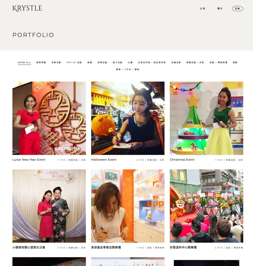
All 85 events, actually reachable. The filter and Load More feel identical to the originals — they just work.
The lightbox: a plugin becomes a <dialog>
Each event page has a photo gallery with a lightbox. The old one was Magnific Popup (jQuery). The new one is the platform: a native <dialog> element plus ~40 lines of JavaScript for keyboard navigation and swipe. It traps focus correctly, closes on Escape, and costs nothing.
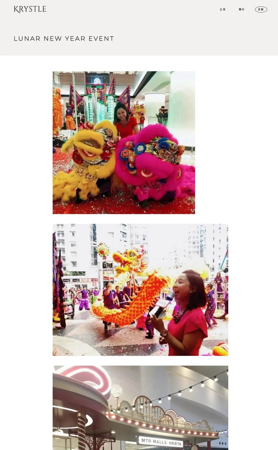
One of the 85 event pages — native <dialog> lightbox, keyboard and swipe included.
Mobile: the same, but honest
Nothing exotic here — the point of the mobile pass was that the rebuild should be indistinguishable from the original on a phone, minus the ten seconds of waiting.
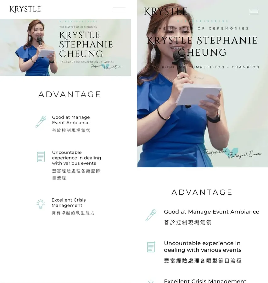
Mobile, before and after. Same layout; the difference is the loading, not the look.
Two small UI wounds from the audit also got closed along the way: both “Read More” buttons on the old homepage had empty hrefs (they did nothing when clicked), and the footer logo linked to the theme vendor’s demo site instead of her own homepage.
The war story: a font that mangled her name
In final review, Krystle’s surname rendered as “CHŒUNG” — the H and E fused into one glyph. In the hero. Of her own website.
First guess: an OpenType ligature in Cinzel Decorative. Disabled ligatures — still fused. A five-row test matrix in the browser isolated the truth: a faulty negative kerning pair in the font file itself, yanking the E inside the H. And letter-spacing doesn’t neutralize kerning — kerning applies underneath it.
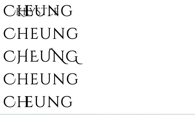
The five-row matrix that found it: default / ligatures off / uppercase / all features off / letter-spaced.
The fix, from the shipped CSS:
.hero-text h1 {
  font-kerning: none;   /* the font's kern pair is faulty — H+E collide */
}The font file Google serves contains a bad kerning pair for this letter combination. No amount of “our code is correct” survives an upstream data bug — the only defense is looking at the rendered pixels with your own eyes, name by name.
The takeaway
Judge the rebuilt UI yourself at krystle.hk — if the design looks unchanged, that’s the success. “Rebuild the UI” didn’t mean redesigning anything. It meant making the same interface true: the button loads, the filter filters, the lightbox opens, the name renders. Most of the JavaScript’s job wasn’t to enable the experience — it was standing between the visitor and the content.
This series: Part I — WordPress → static HTML, and the honest pros and cons · Part II — you’re here · Part III — the SEO story · Part IV — the site was live, then came the lessons.
Does your site’s UI actually do what it looks like it does? Worth checking — email me if you find something scary.